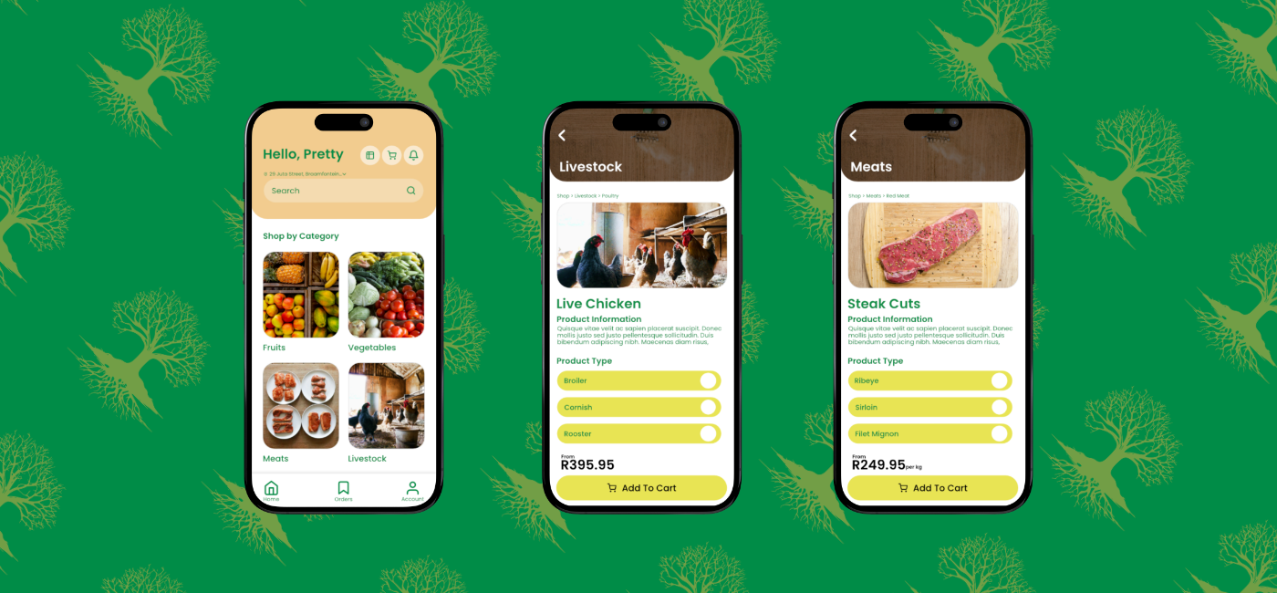

eFama is a decentralized web3 app built on the Coronet Blockchain technology, designed to empower farmers to sell fresh produce and meat directly to commercial buyers and consumers in Africa. It's mission is to restore trust, transparency, and simplify fair trade across the continent's supply chains.
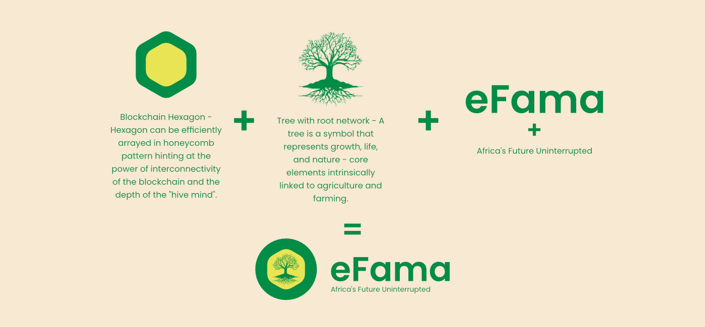
This logo concept neatly encapsulates eFama's core mission, conveying modernity through blockchain tech while staying firmly rooted in agriculture and African farming heritage. It's a symbolic and impactful logo that can become a recognizable emblem of trust and traceability in produce supply chains across the continent.






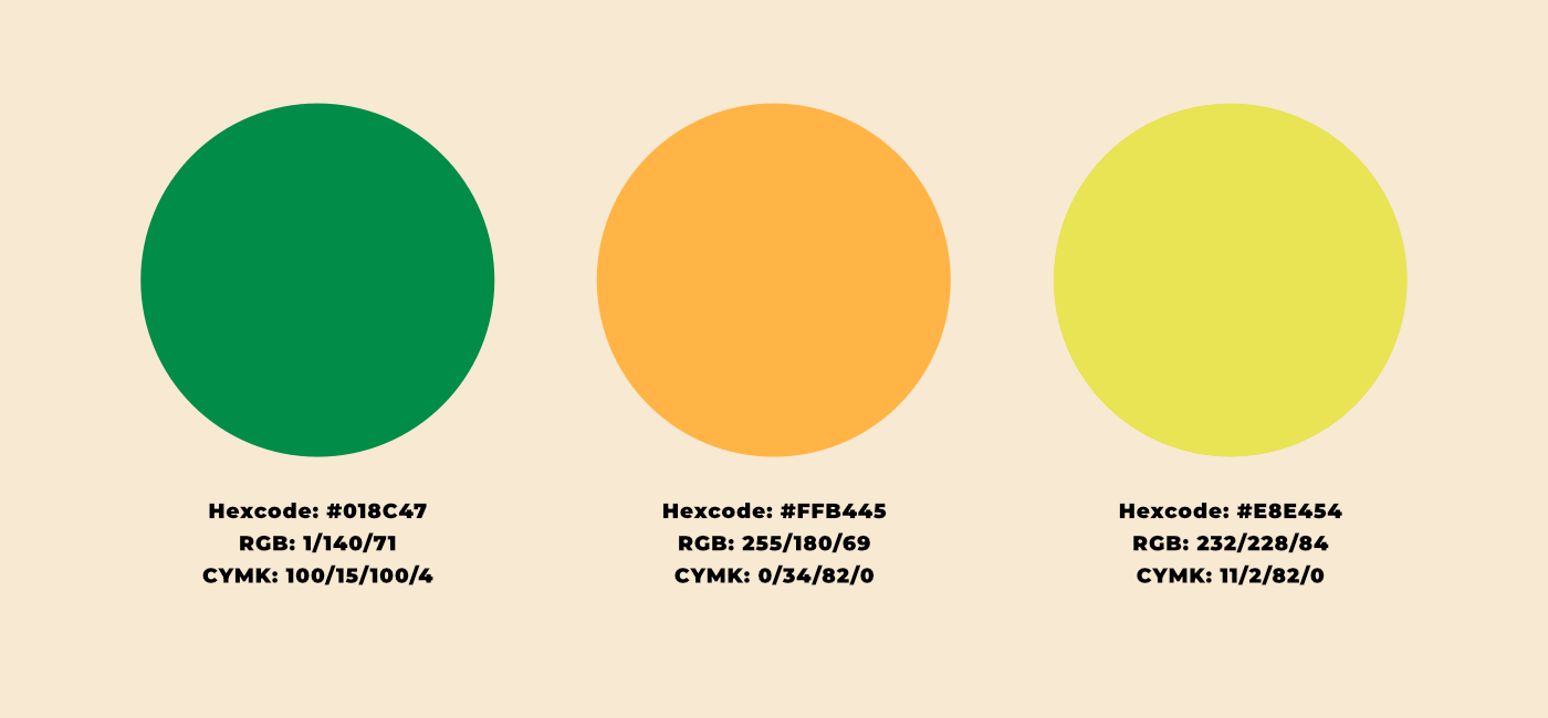
Strategically incorporating this green, orange, and yellow palette into eFama's logo and branding effectively communicates the company's core values, sustainable agriculture focus, innovative technology approach, and commitment to transparent African supply chains. The color choices resonate with farmers and buyers, fostering trust and credibility while creating a memorable brand identity.


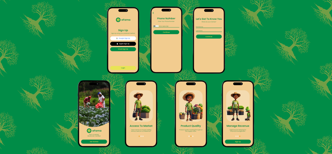
To streamline the onboarding process process, we implemented a brief introductory tutorial to orient new users. We broke down the process into multiple intuitive steps, grouping related fields together to improve organization and comprehensioin for users.

To create a more intuitive user interface and navigation, we explored grid and tile-based views to better organize their products. We further implemented robust filtering and sorting capabilitites to enhance the product browsing experience. Our team established a cohesive design system with consistent UI components and branded elements to ensure a seamless user experience across the platform.
